You’re not annoying, no problem at all, but you know the limit is 3MB for tumblr now, right? Well, it can safely post when it’s up to 2.994MB on my Photoshop, anyway.
There are a variety of ways to get it down to size. Let’s see:
1)
In my previous post, I mentioned how sometimes I’d go for the Limit to Every 2 Frames option when importing video frames sometimes. That halves the number of frames which makes a huge impact on filesize. But it may not be the look that you want. Here’s a gif with every frame left in:
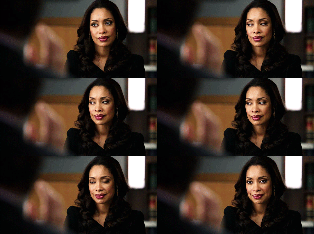
And now every 2 frames:

Still lovely (how could that face not be!) but certainly not the fluid smoothness of the first one either.
2) Remove any extra frames you can. You can also remove frames from the beginning or end of a scene or if there’s a camera switch in the middle, you could remove frames right before or after the switch without it looking too jarring.
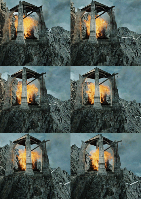
I actually have a fun actual example of this one. Way back in 2011, when each gif could only be 500KB, I made a gifset for the Lightning of the Beacons scene in the Lord of the Rings. This is one of the gifs then, found on somebody’s reblog of it, lol:
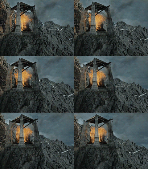
And here a couple of years later, redone when the limit was raised:
3) Crop it shorter, height-wise. As in, you know the width has to be set at Tumblr specifications, 540/268/177 pixels wide for each of the full/half/third image layouts, respectively, but the height is up to you. Big difference between
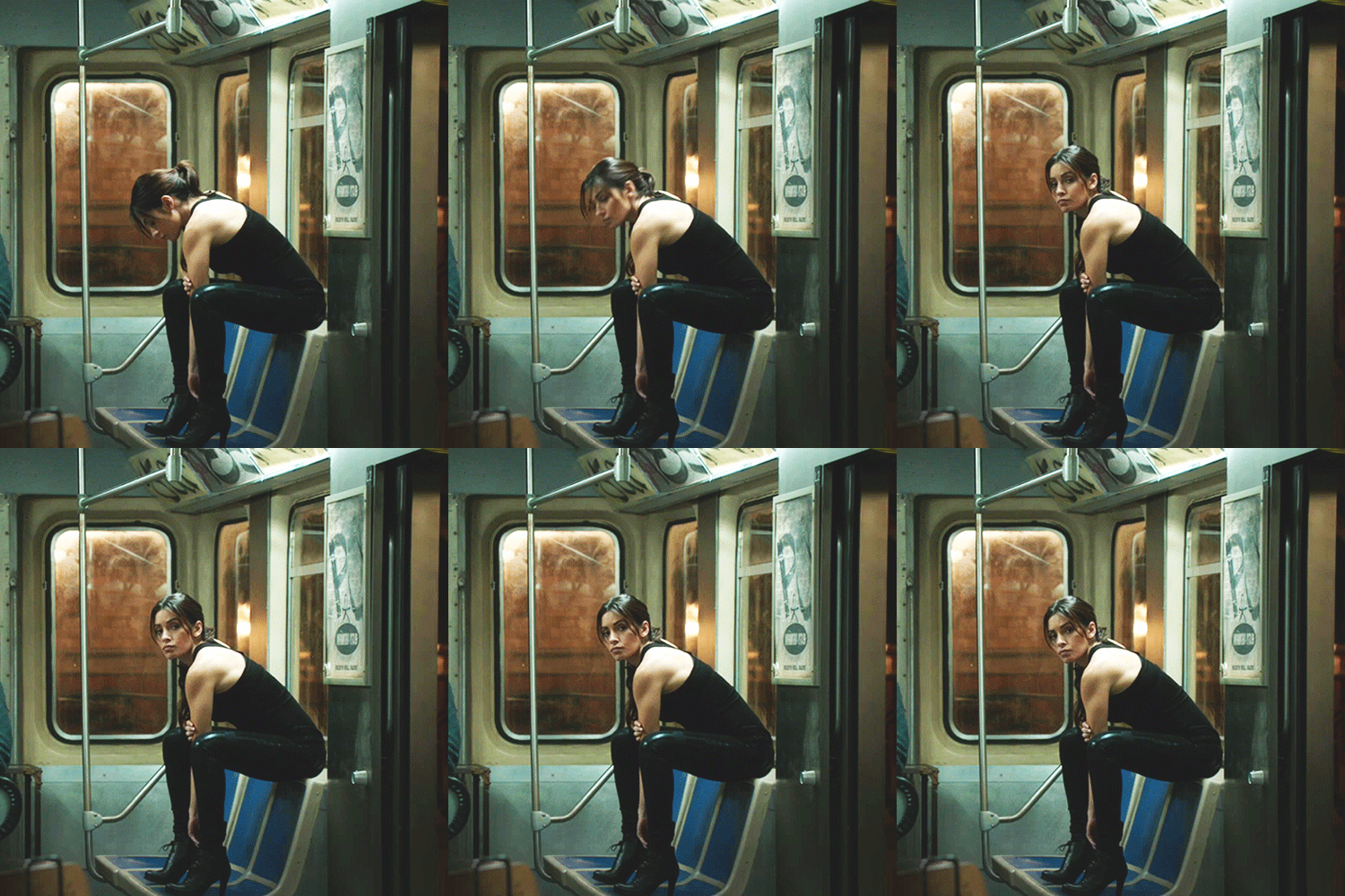
and
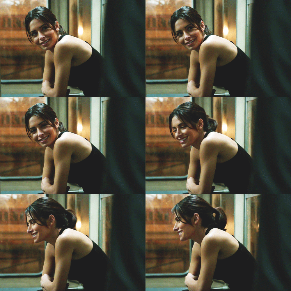
Both of these are from the same gifset, not for any stylistic reason, they were supposed to be the same height, but the second one was just way too large. And so, shortened that sucker.
4) Freeze part of the picture in the back. You can probably notice it in the first gif above, but the background is completely frozen. Not just in the shot itself, but in the gif. You take the layer for the last frame and duplicate it, making sure it’s visible over all the other frames. Then erase the portions where there’s movement. I usually click on the first frame (keeping that last layer selected) and erase where the movement is, it’s easier to compare that with the still visible last layer, then play the gif a few times to make sure there isn’t anything I’ve missed. The idea is to have as small an area of movement as possible for the gif algorithm to have to actually store.
It’s easiest to do these with scenes where the camera isn’t moving, although back in the olden days when we had to fight for every KB, I’d sometimes to try to “force” that same steadiness by selecting all the relevant layers and then going to Edit > Auto-Align Layers and playing around with which option worked best, usually Auto or Reposition for me. That would stabilize the viewpoint such that everything in each frame was in the same place.
This gif is 732KB.
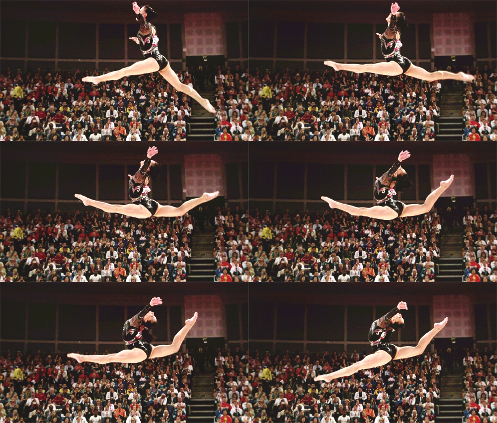
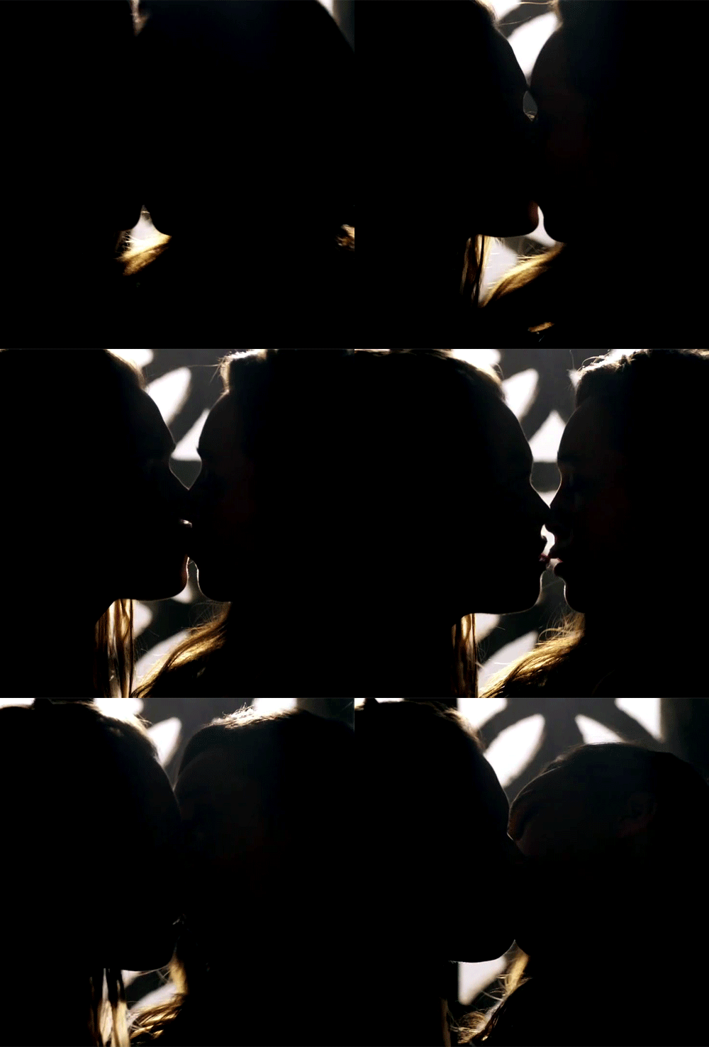
5) Play around with adjustments, specifically Levels or Curves. I usually stick with Curves now, I’ll move it toward the upper left on the top and toward the bottom right on the bottom. Like a good detergent, it brightens the lighter colors and darkens the shadowy areas. It helps on both ends, the brighter you get, the more the gif algorithm sees it as a solid patch of whitish colors, same with the black in the shadows. Last resort is to use the Exposure adjustment and use the Offset slider, just a tiny bit on the negative side will darken it dramatically and usually decrease filesize. Or if you’re in the mood for it, make it positive and go for the mellow look, that lowers the wildly different colors.
This bigass gif is 1.5MB.
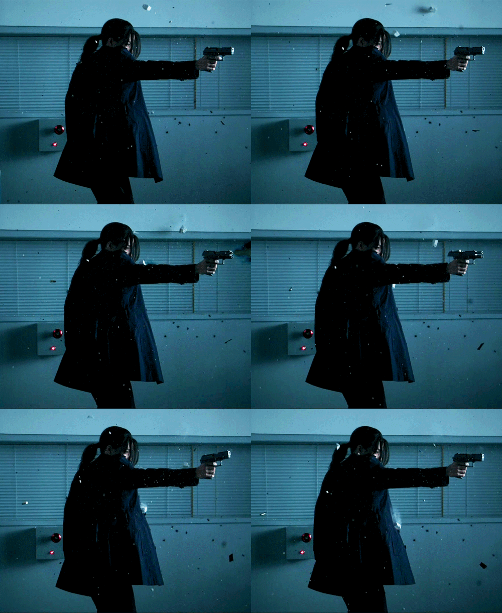
6) Lower the number of colors when saving the gif. This can make a gif look real ugly real fast, but if it’s mostly one tone or if it’s a very busy gif, you can get away with cutting it down to 128 without any major damage. I don’t usually go lower than that, unless it’s a black and white or deliberately styled sepia or whatever coloring to begin with. And speaking of which, that is also an option, to deliberately lower the number of colors, either you can move the saturation down or choose Grayscale when saving. Or instead of black and white, move the whole gif toward a specific color
Had to get this under 2MB (back when), ended up going with just 148 colors (see how it’s a blue-gray-green tone overall anyway):
7) While saving, Adaptive is usually the color reduction algorithm that takes the most space, I go with Selective, though it can change depending on the image. In choosing the dither algorithm, I tend to go with Diffusion, although for a while I was all about Pattern (that was the one that that tiny squared grid visible the moment the colors got weird). With Diffusion, you can lower the Dither percentage or increase the Lossy amount, and again, if it’s that kind of gif, you could get a huge decrease in size by just a small modification, but also can look very ugly very quickly.
8) Switch from 540px to 268px or 177px. Sometimes you just gotta make that decision. If you tried everything else and it’s not anywhere near the limit, it may be time to go with the smaller size.
