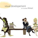
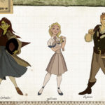
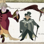
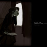
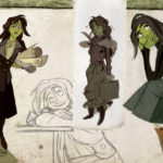
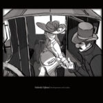
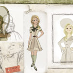
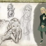
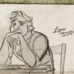
My old student portfolio for Visual Development (Character Design) based on “Wicked” – PART 1 –
Because I often receive questions about portfolios, I thought, well, maybe it would be helpful for some to share my own personal experience accompanied by some visuals. Namely, my own portfolio I submitted to transition from the Animation department to the Visual Development department of Disney Feature Animation.
Now one thing that I will mention here as a disclaimer, and something that will probably be reiterated through out this post is that this is only my personal experience, and there is definitely not any sort of “formula” to make a portfolio for the Disney’s Vis dev. Portfolios that look nothing like this, share no common element, is just as likely to get you into the vis dev department. The acceptance is made by a committee of people, and not just one person’s personal taste or criteria.
Way back in the summer of 2007, I was an artistic intern at Disney. (Mainly 2D character animation, but also some story and vis-dev on the side.)
I was having lunch with one of our mentors at that time, Claire Keane, in which she gave us some advice on structuring a visual development portfolio.
One of her suggestions that stuck to me was to take one story, and dedicate the entire portfolio to it, as if you were developing that into a feature film.
This idea sounded good to me, because it made sense. It’s a semi-simulation of the kind of things you would be doing as a professional artist at Disney anyway, (which gives the reviewers a much better, reliable idea of how you would perform as a contributor) but it also gives the spectator a slightly more immersive viewing experience, as they are taken through one continuous story, with characters they understand, rather than having to adjust to brand new content with the turn of each page.
The many times I have reviewed portfolios, I have also found it a slight handicap to have to ask the artist, “Now, what is this thing from?” 4 or 5 times in one portfolio.
So in 2008, while I was working on Princess and the Frog, (still as a full time student at Calarts), I started on this visual development portfolio. I chose my story to be Wicked, the musical, which I am sure many of you are familiar with.
When I look back at this portfolio, obviously I see so many flaws in terms of draftsmanship, design choices, character choices, taste etc, and I want to fix them all. But again, the purpose of this post isn’t to show who I am as an artist right now, but to dig up my past and say “Well this is how it happened for me in the past.”
Here is part 1 of the portfolio. I know for some it may be frustrating to have this divided into 2, but the nature of tumblr posts seem to want things kept short. So I’ll try and post part 2 of the portfolio as soon as possible. I want to say within the next day or two, but there’s just never knowing with when I’ll get another free moment.
I think what is probably most important to show in your portfolio is a strong draftsmanship, a good taste in design choices, and a special intuition for characterization.(I’m speaking for my own criteria when I review portfolios, and I don’t claim to represent anyone else’s.)
As you can see I also tried to pay attention to the presentation of the portfolio, which is why I tried to design the layout of it with the theme of “drawer of a Shiz student”.
I’ll probably try to address some of those things that I mentioned in future posts perhaps.
I hope this old student portfolio of mine gave you a better idea on who to shape your own. One thing I would recommend is to not copy exactly the method I used to form a portfolio, but see it more as a solution that will hopefully help you come up with your own solution on how to structure a portfolio.
Next up is Part 2, with some development designs of Fiyero, the Wizard, the Flying monkeys etc

Just another WordPress site
